top of page, top of mind

the brief

Xero wanted to find a way to hero the tagline ‘beautiful business’ in improved advertising guidelines.

They had a newly designed website which featured a new set of colours and elements. So their marketing asset designs needed a refresh to align and create a consistent visual identity when going to market.

client

Xero

project type

graphic design

deliverables

branding templates

stage 1

getting to know the new Xero

We analysed and studied competitor designs, received feedback from the market and internal stakeholders. Most importantly, we assessed the new website to inform the iterations we were to make to Xero’s advertising design.

stage 2

testing things out

We experimented and tested a range of different directions to see what would not only look beautiful but function well. We had to consider smaller bottom of the funnel ads as well as large scale campaigns, different artwork like illustration, customer and product photography. Accessibility was very important to us - creating templates that made sense, and presented well in colour, type and shape.

stage 3

something for everyone

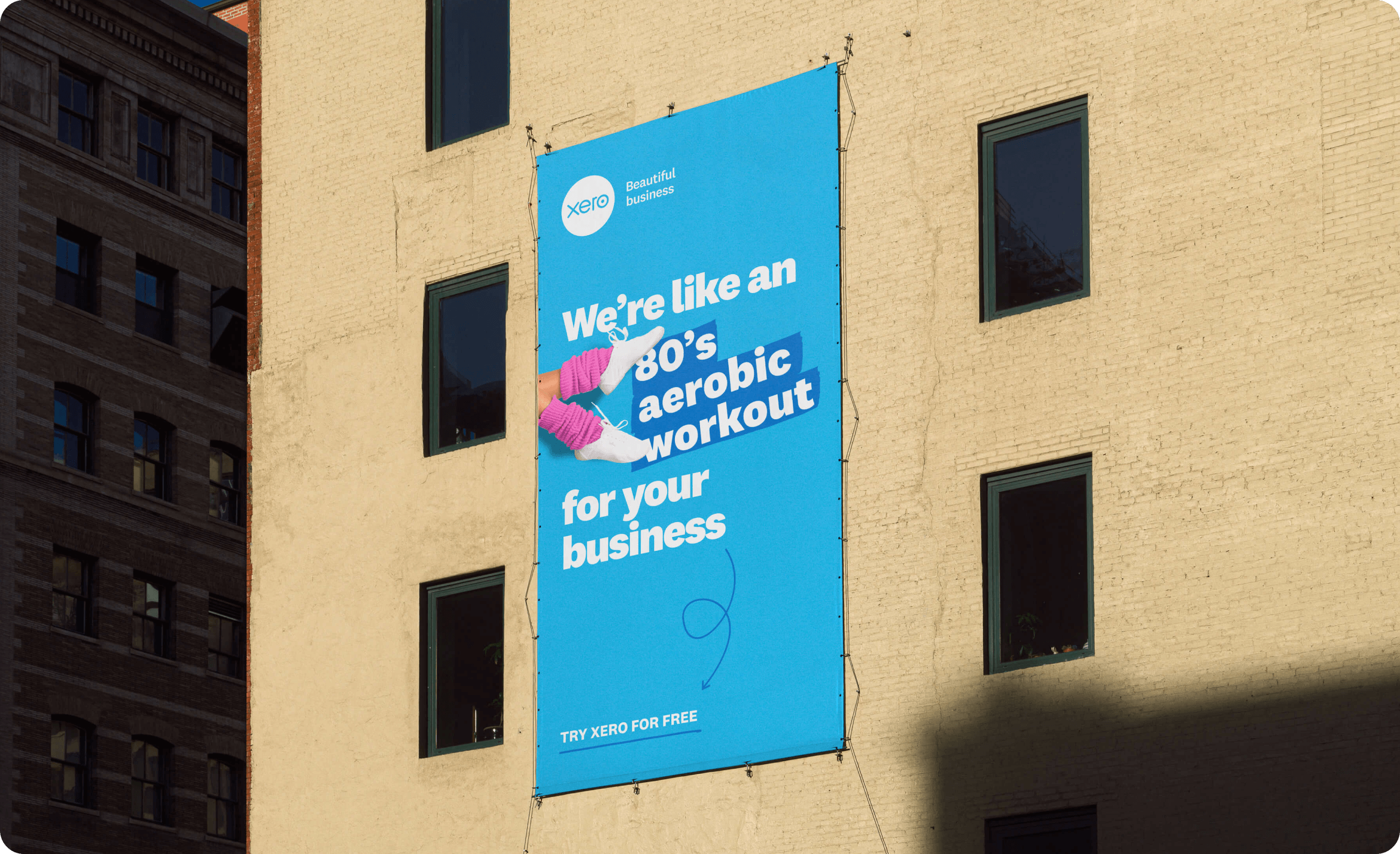
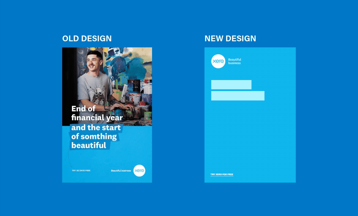
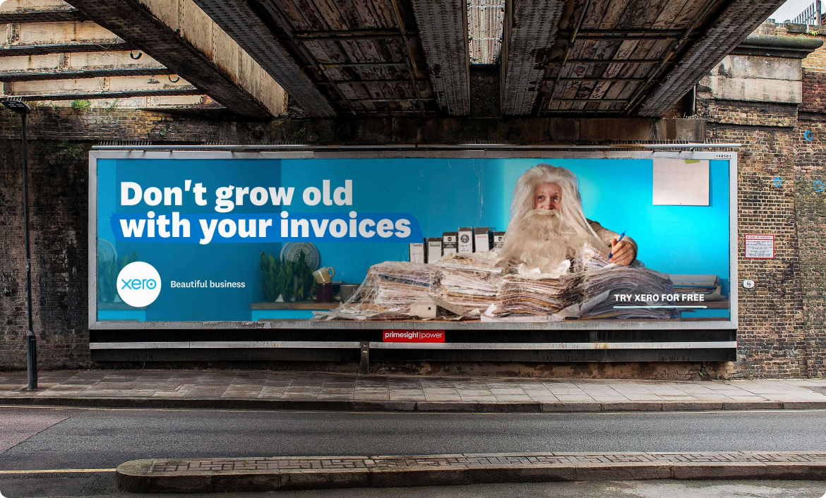
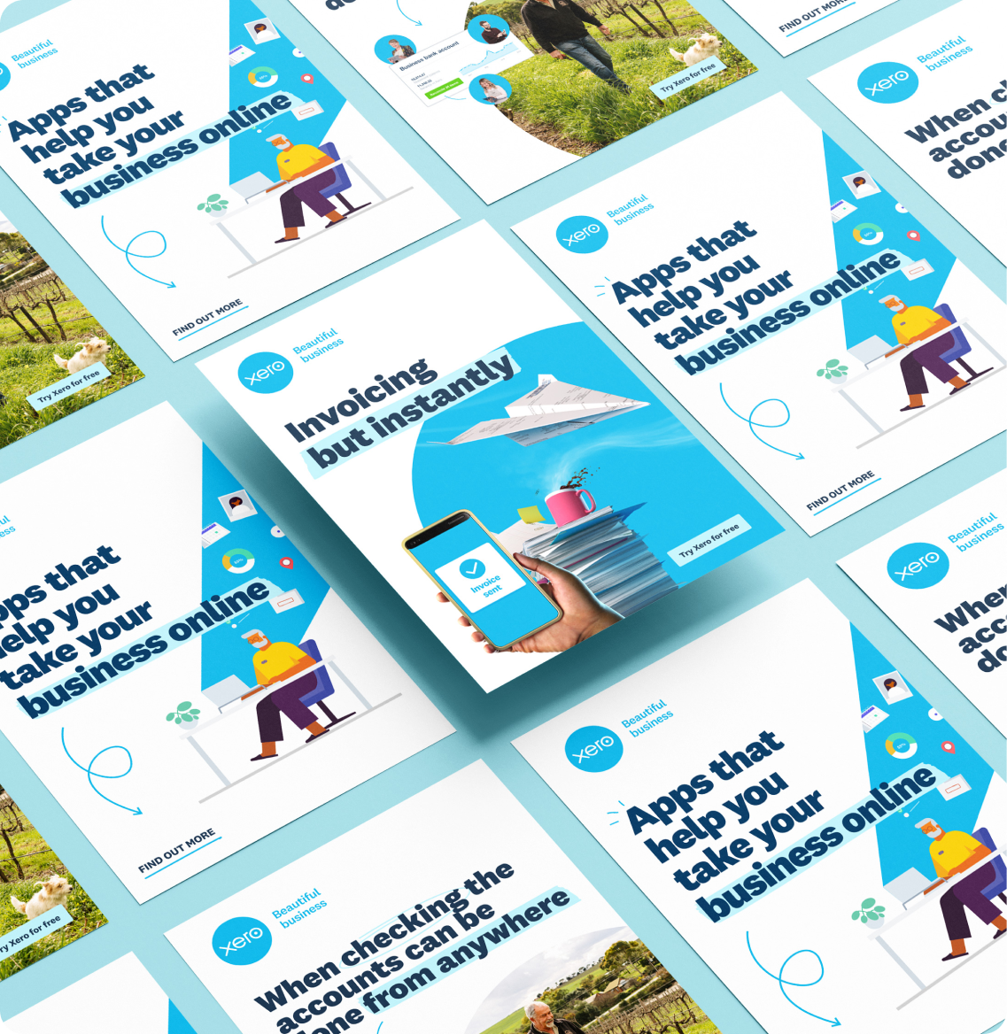
Today’s brands are more than just static. We presented a dynamic and versatile unifying graphic device of the scalable circle, an essential element of Xero’s visual identity that can adapt and change depending on the use case.

We placed the logo at the top where possible, emphasising our tagline - ‘beautiful business’ and always keeping it at the top of mind.