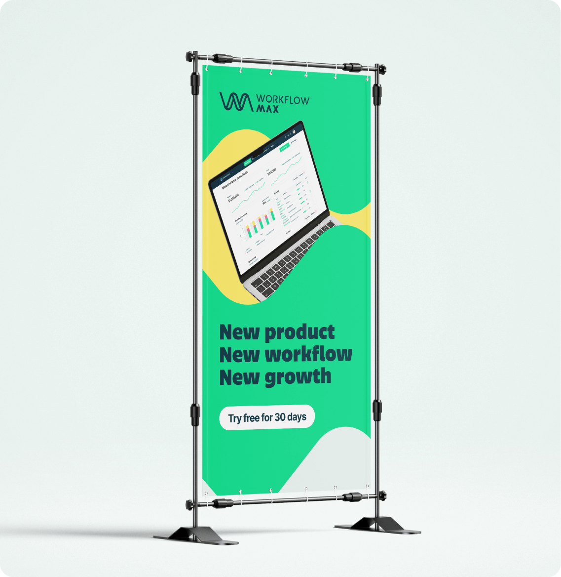
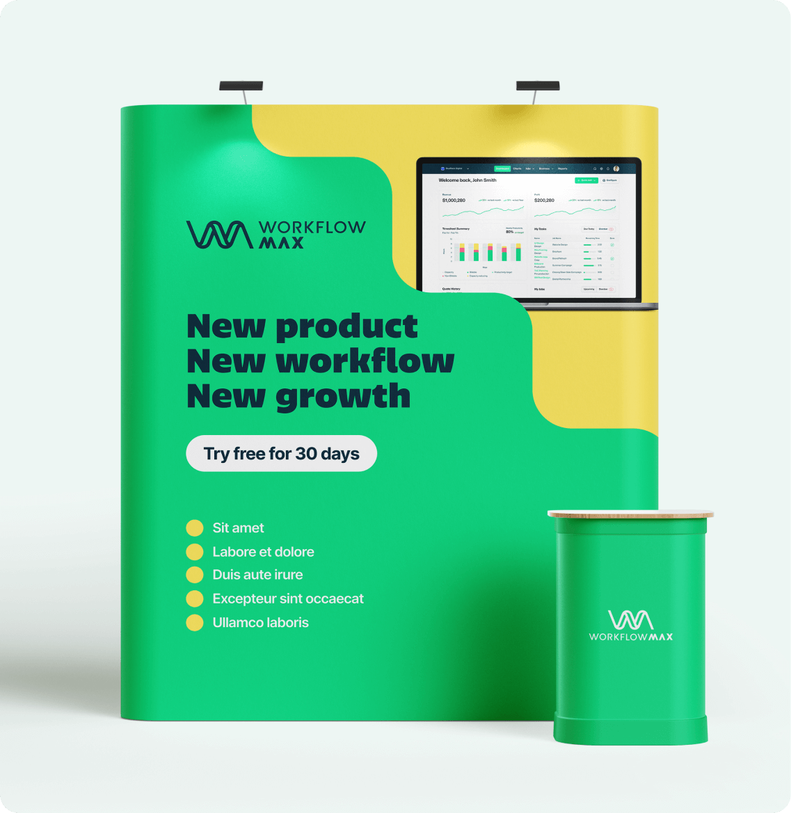
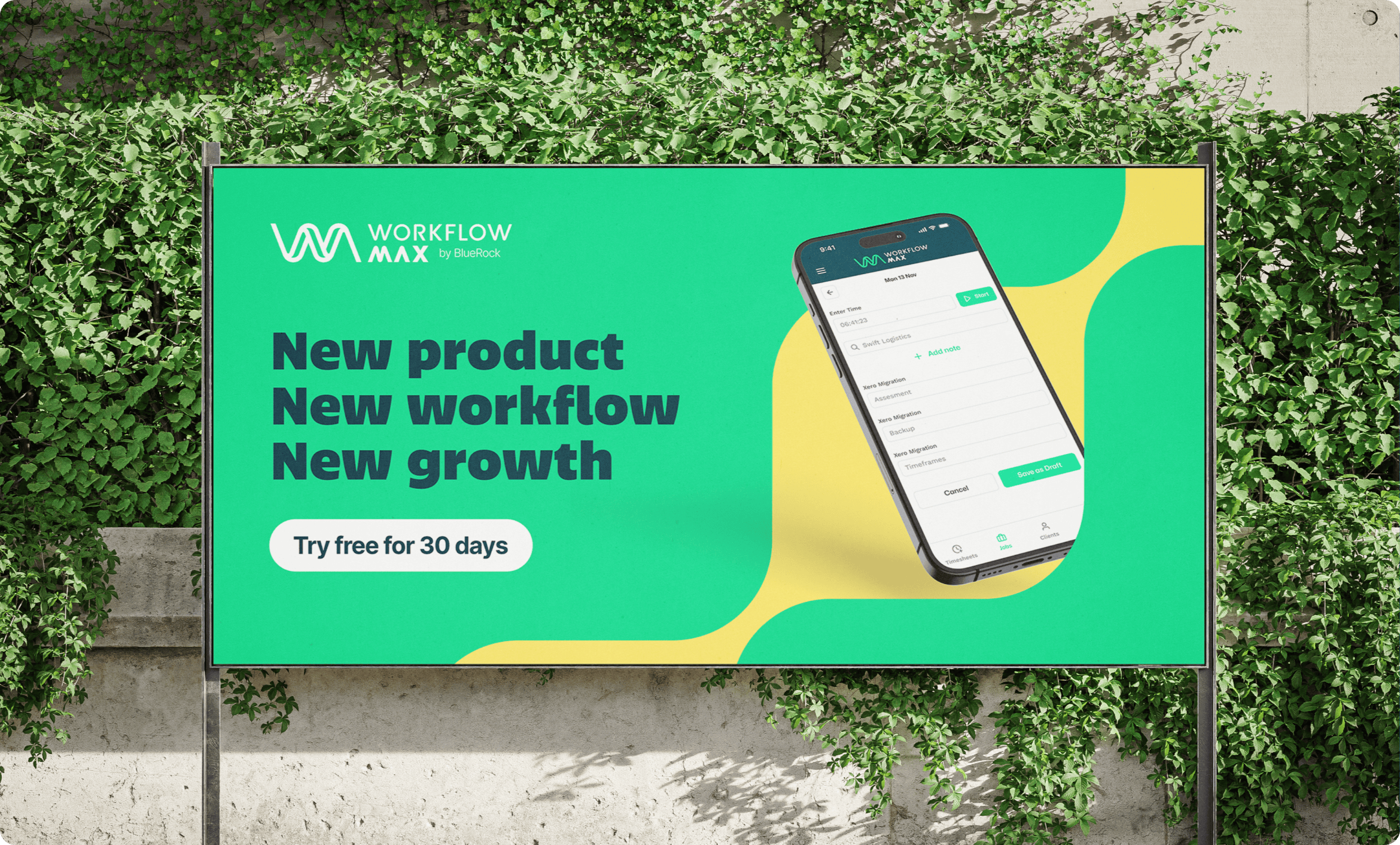
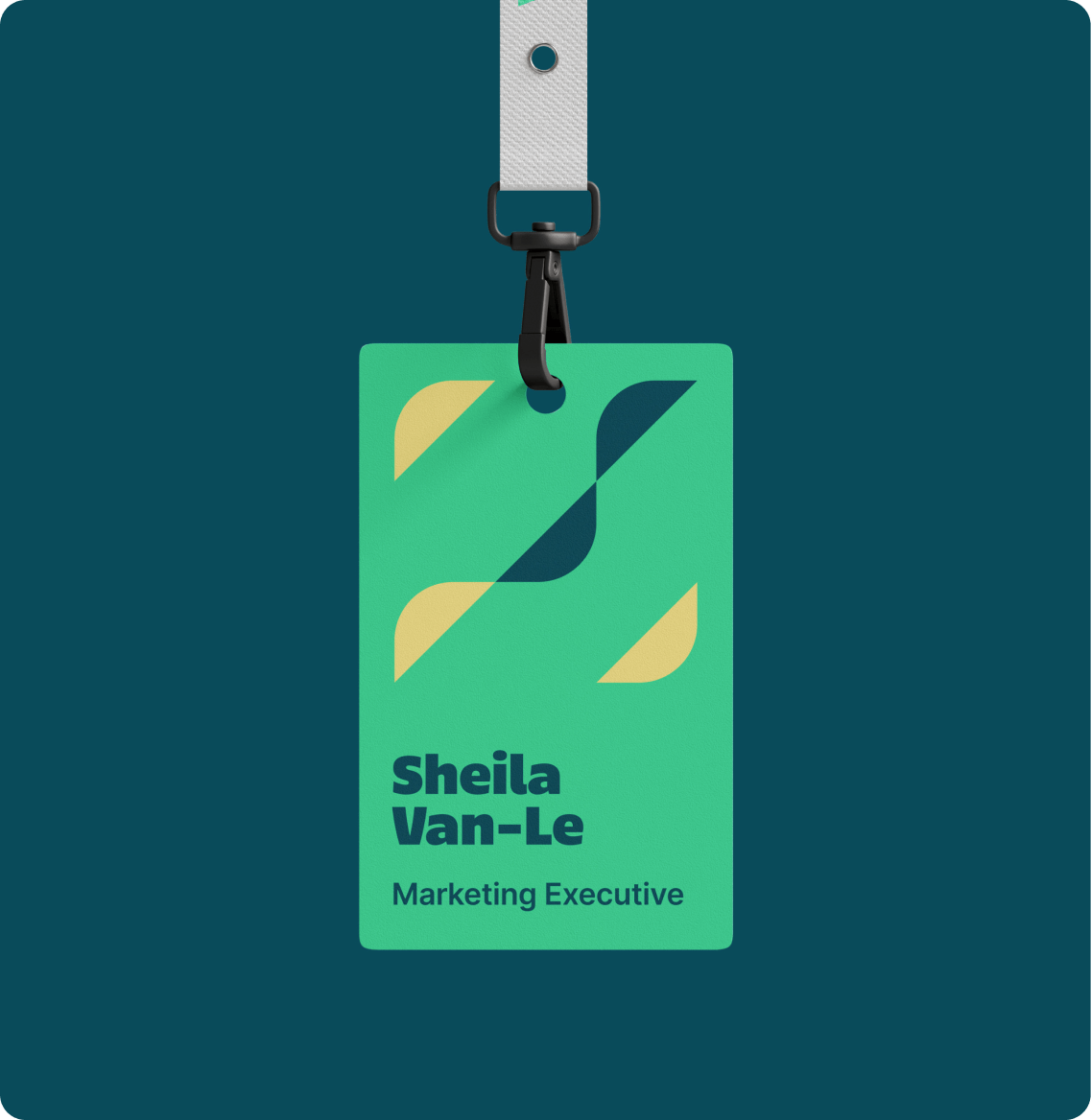
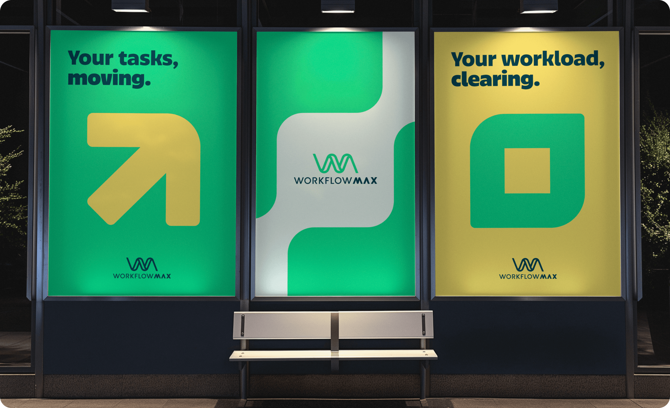
building a strong brand for a big future

WorkflowMax is a SaaS company with big goals since being acquired by BlueRock. They needed a refreshed visual identity that reflected the new chapter of growth and development that they were embarking. Like a butterfly coming out of it’s cocoon, the new visual identity marks the start of their transformation.

client

WorkflowMax

project type

brand

deliverables

visual identity, illustration system

visual identity

boldly managing workflow

As a customer first company, their visual identity has been designed to reflect it, we’ve simplified the logo and updated the colours to a limited but impactful palette. A playful, dynamic illustration library has also been introduced, focusing on creating a visual space that is relatable, accessible and reflects the company’s customer base.

We wanted a clear visual language that carries through with WorkflowMax’s new direction. Clean, simple and functional.

illustration

a modular system

To help break down the complexities that come with job management, we knew that illustration was essential to a bold and approachable brand. We built a modular illustration system that was set up for efficient asset delivery, but was finessed in it’s shape and form.